Introduction

My name is Jerom Thambipillai (8692). I am part of Group 2 consisting of Olamide Ajisafe (8010) and Matthew Davies(8511). I have completed Brief 1: Film. To see my portfolio evidence please click on the labels on the right named "A2 research and planning plan, A2 construction A2 evaluation"

music video

Below is our finished music video

Group 3 Music Video Layla Obi- Blue Lights

digipak

Below is the outside panel of my Digipak Album cover

Group 3 DIGIPAK FRONT COVER

Group 3 DIGIPAK FRONT COVER

Album cover

Below is the inside panels of my album cover

GROUP 3 DIGIPAK INSIDE COVER

GROUP 3 DIGIPAK INSIDE COVER
Click on the picture below to be redirected to our website


Showing posts with label A2 Construction. Show all posts

Monday, 26 September 2016

Construction Post 6: Website post-production

In order to create our website we used the software "Wix". A website is crucial for an artist as it acts as a source of official information and links for the fans. It is a common convention for artists to have and thus was a must for us.

Wix was relatively easy to use in terms of adding content. This was quire useful as the website could easily be altered and elements could be added relatively easily, considering that most websites are made purely from HTML code. The tool bar with all the choices of pre-made elements could be seen below
All of Wix's pre-made elements made crafting the website much easier to do, as oppose to coding each element
However despite Wix's multiple options Wix would often lag and even crash at times. Sometimes you would even have to refresh the page if certain tool were not working. This definitely decreased the efficiency of creating the website, with this specific challenge we had no choice but to continue using Wix despite its issues. 

We included the following pages on our website
  1. Landing Challenge
  2. Home
  3. Music
  4. Gallery
  5. Tour Dates
  6. Merchandise/Shop
  7. Bio
  8. Sign up
These pages could easily be navigated using our menu bar located at the bottom of the website

Our menu bar with all possible pages for easy navigation 
Within the menu bar social links could be found for twitter, YouTube and Instagram, social media is a form of cross media convergence that can span multiple platforms. The links also promote interactivity as the consumer is expected to click on these icons to reach our artists feed. From their they can follow, message our artist as well as share content we have posted, 

social media links

The twitter profile I made
 
These social media links are a common convention in artist websites and can be seen in izzy bizus website below. 

izzy bizus social media links
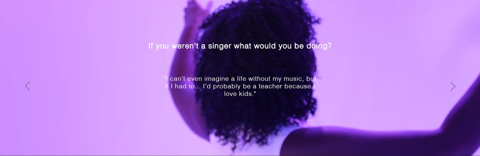
In order to promote more interactivity within our website we included a Q and A page in which the consumers can scroll through with. A few extracts of this can be seen below.


On the first slide of the Q and A the words "Layla Obi" is stylized in the amarillo font. This is a re-occurring synergistic element within our artists content. For example we can see this in all pages with "Layla Obi" written as well as our DigiPak


Stylized "Layla Obi" on our "home page"
Stylized "Layla Obi" on our bio page
Stylized "Layla Obi" on menu bar 
Stylized "Layla Obi" on all our merch

On our home page we have a live video for the background which I filmed and partially edited. The footage cam from mostly takes that we didn't use as well as just shots that look aesthetically pleasing. This formed a really good aesthetic and mood to the website as a whole. We were really inspired by Dua Lipas and Izzy Bizu website which had video elements in their background as well as a continuous scrolling function. A video of their website and our website can be seen below.


Overall I am very pleased with my website as i feel it fulfills its purpose and meets all the conventions of a music artists website. I also think it has a very sleek and professional look and could be mistaken for a website in the actual industry.

Construction Post 5: Digipak post-production

In order to create our DigiPak we used the software Adobe Photoshop CS6. Although I have had some previous experience with Photoshop a few years ago for a previous project, I had to reteach myself how to use most of the tools.

Before we began to Photoshop we were given the following template. This template had the correct dimensions so that when it came to printing our covers our image would fit in place.


This template was useful during construction as it acted as a constant guideline throughout the construction of the DigiPaks making sure we kept it in proportion and to the right dimensions.

Outside panels

Front Outside Panel

After taking our promo shots in Shoreditch we had decided to use the following images for our outside panels.


In order to obtain these images we initially used a bridge camera and attempted to turn on continuous shooting as Olamide jumped. However these images turned out blurry so we decided to use Matts phone instead which resulted in a clear image of Olamide in the air. We also took a separate image of the graffiti without Olamide to use for the back cover panel.

In Photoshop I adjusted the Hue/Saturation and used Selective Color in order to make the graffiti brighter and more vibrant.

The layers I created on the original image in order to enhance the graffiti. 
The difference the layers made can be seen below. 
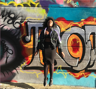
Original image taken
enhanced image after I edited it in photoshop
After this I added the same stylized "Layla Obi" logo that is seen across all the content we have produced. This forms a synergistic link and acts as a form of branding, 

Our amarillo font for the stylized "Layla Obi"
The words "London Colour2 was then added with the "Nova Font". We picked this font as it managed to stand out despite being in front of a vibrant wall full of graffiti. Borders were then added to make "Layla Obi" and "London Color" stand out more. 

The final front panel

Back outside panel

The back outside panel was slightly more complicated to achieve. This is because first I had to select Olamide out of the original picture.This proved to be extremely difficult and took me quite a few tries before I was able to isolate her and was a huge challenge to overcome. The main source of difficulty with this task is that Olamides curly hair was hard to select in much detail due to its fine detail. 

The first tool I used was the magnetic lasso tool however this did not work well as it could not isolate her well. The outcome would always result in accidentally selecting too much of the image or too little. After numerous failed attempts using this tool I eventually moved on to use the quick selection tool. 

The magnetic lasso tool I originally used
The quick selection tool was far superior in isolating Olamide from the graffiti. This is because it had options to go over the selected area. This meant that after selecting a very rough outline of Olamide I was able to go over and make the selection more accurate. This did take me a few attempts but it was a much more suitable tool for this task. 

The quick selection tool
The negative select option was extremely useful with this tool as I could go over the area I selected in more detail
This tool also had an adjustable brush size. This meant that I could zoom into the picture and use a smaller brush in order to finally isolate Olamide from the picture.

the adjustable brush length gave me accuracy with selection that I simply couldn't achieve with the previous tools
After I had selected Olamide I used refine edge to select her in more detail, this was mainly in order to get a recognizable and smooth shape for her hair. Within refine edge I played with the smoothness, feather, contrast and Shift edge functions in order to get a decent shape for our silhouette.

The refine edge options
After olamides silhouette was finally selected we added a clipping mask layer and put the graffiti image behind it. 

The silhouette with the graffiti layered behind it
However after seeing what the graffiti looked like we decided to use the Clone stamp tool to merge various images of graffiti from the wall to make an entirely new piece of graffiti. Me and Matt spent a lot of time as this was very much a trial and error process. At times the graffiti clashed and simply did not look good. However after several attempts we ended up with a image we we're happy with. 

Our finished version
After this was done our back cover was almost completed. I looked into various album covers to find out the conventions when it came to institutions. I came up with the following list 

  1. Barcode
  2. Artist logo
  3. institution logo
  4. website
  5. Copyright information
Adding these conventions were quick and simple in comparison to isolating the silhouette so I managed to complete this in a few minutes


Inside Panels

Front inside panel

After shooting our promo shots we decided on using the following image.

Our original idea involved a side-profile shot of Olamide however after viewing the ones we shot we decided to scrap this idea. However from an interview we filmed during shoot week we managed to screengrab the following image


A minor challenge was that with this image Olamides eyes we're initially open however this was quickly resolved with the use of paint. 
The two images were then selected and put onto a white background. However due to these images being produced in a studio the white did not match. This problem was easily resolved by simply increasing the brightness. 

Matt originally made a version which had a font stylised as writing, however it seemed cheap and as simply not effective. In order to resolve this issue we used Olamides writing, we complied a list of words which were then written on a piece of paper. I also added a few doodles as an experimental idea which i think worked really well. The list of words were designed to reflect our artist as a person and to represent her inner thoughts. This draws back to the idea that Layla Obi was a person that audiences can relate to. 

Original list of words
words written in Olamides hand writing with my doodles page 1
words written in Olamides hand writing with my doodles page 2
The sheets were then scanned in and transferred to Photoshop. I then individually selected each word and doodle with the Polygon lasso tool. 
Polygonal lasso tool

After placing the doodles and writing around the images for our inner panel they ended up looking extremely faint. 


In order to combat this issue I used a level layer in order to make the writing stand out more. 

Levels 
the finished inner right panel
The finished inner left panel


Construction Post 4: Music Video post-production

The software we used to edit our music video was Adobe Premiere Pro CS6. I found this software easy to use as I have had a lot of previous experience editing previous school projects and personal videos on Premiere Pro.

Our video consisted of a narrative centering around a male trapped in a nightmare sequence and studio shots of our artist. I felt that this was a hard video to edit as we had to build atmosphere for the video as well as have a clear narrative sequence that was easy to follow. This made the process of editing quite hard as we often produced sequences that didn't flow easily.

Beneficial Tools during editing

Below are the tools that we used most whilst editing our sequence. 

For basic construction of the sequence we used 

Mark In & Out


The mark in and out tool was useful when isolating takes from our rushes. The short cut for "Mark In" was the letter "I" on the keyboard and "Mark Out" was the letter "O" on the keyboard. This made cutting out segments of video easy and quick to do, thus making our overall edit more efficient. 

Razor Tool


The razor tool was used to fine cut our clips. This was useful as it was a quick and easy way to fine tune our edit so that each clip lasts just the right amount of time. This was also useful when I had cut to the beat of the music which required precise editing. An example of a section I edited to the beat can be seen below.

example of fast editing to the beat in our music video.


Slip Tool


The slip tool allows the clip duration to remain the same  whilst changing the position of the video. I found this specifically useful when we had already cut a clip duration to match the beat however it was the wrong section of video. The slip tool was also used for some of our more complicated shots where we matched jump cuts. This can be seen in the GIF below.


matched jump cuts

Effects

After showing our test video to teachers and members of our target audience it was clear to us that our video simply did not flow. In order to combat this problem we used a mixture of cuts, various dissolves and dips to black in order to flow better as well as build atmosphere. 

Extract from our sequence containing Dips to black and Cross Dissolves

Here is a segment that contains two cross dissolves and a dip to black. The resulting footage looks like the GIF below. 
Extract from our final video containing Dips to black and Cross Dissolves
When editing these sections I found it was mostly trial and error with which effects to use. For example some shots did not look good together as the set ups did not look varied. This was definitely a challenge during the editing process as it took a few different variants of the sequence in order to get it right, however this was overcome after multiple tries and feedback from our teachers and target audience. 

Alterations

During this week we received regular feedback from our teachers and target audience. This was useful as we we're able to easily alter our timeline according to their views.

For example one issue that was raised was that for our "dream-sequence" section of the video it was not clear that it was a dream sequence. This was swiftly changed by using an alternative take and adding in a dissolve. This was received well by our target audience and thus the issue was resolved. The finished section of the video can be seen below. 

dream-sequence section of our music video
A huge alteration to our video was that it was far too long. Our music video lasted 3 minutes and 40 seconds however our brief specified the music video had to be three-minutes. Although this was a shock at first, the shortened music video turned out to be way more interesting and flowed so much better. 

This issue was tackled by the music being edited down on premiere pro by studying the wavelengths of the song. A point was found were we could smoothly cut out a section of the music in order to have a 3 minute version. After this we moved the sequence accordingly which left us with a much slicker music video. This is because we had previously had excessively long shots in order to fill the entire song, these shots we're then narrowed down which improved the music video as a whole.

Old Time-line which lasted 3 minutes and 40 seconds
Time-line after being reduced to 3 minutes

Grading

Grading is the enhancement of colors in a video. It greatly affects the mood and atmosphere of a video and also increases the production quality of the whole music video. Grading was especially important for our music video as it completely amplified the look of graffiti in most scenes. Below are a few screenshots of graded and ungraded footage I edited.


Extract 1 not graded
Extract 1 graded
Extract 2 not graded
Extract 2 graded

Extract 3 not graded
Extract 3 graded

The main tool we used to grade was ProcAmp, this allowed us to alter the following aspects of our video. 
  1. Brightness
  2. Contrast
  3. Hue
  4. Saturation
Although Three-way colour corrector was also an option in the grading process, after using it for the first few shots we decided it was unnecessary and did not help us achieve the look we wanted. Thus using only ProcAmp was sufficient.

A challenge when grading is that each shot has to be done individually and there is no specific setting that will work for each shot. It was a very time consuming process due to the sheer amount of shots we had in our three-minute period. Another grading related issue is that often skin colour would have an orange-tint. This was solved by not increasing the saturation as much, however this took some vibrance away from graffiti- finding a happy medium between the colour of the graffiti and the orange tint was key in this process. 

Below you can find our finished music video. I am very pleased with the video as I feel it has improved a great amount since our very first test shoot version.