Before we began to Photoshop we were given the following template. This template had the correct dimensions so that when it came to printing our covers our image would fit in place.
This template was useful during construction as it acted as a constant guideline throughout the construction of the DigiPaks making sure we kept it in proportion and to the right dimensions.
Outside panels
Front Outside Panel
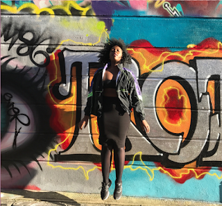
After taking our promo shots in Shoreditch we had decided to use the following images for our outside panels.
In order to obtain these images we initially used a bridge camera and attempted to turn on continuous shooting as Olamide jumped. However these images turned out blurry so we decided to use Matts phone instead which resulted in a clear image of Olamide in the air. We also took a separate image of the graffiti without Olamide to use for the back cover panel.
In Photoshop I adjusted the Hue/Saturation and used Selective Color in order to make the graffiti brighter and more vibrant.
 |
| The layers I created on the original image in order to enhance the graffiti. |
 |
| Original image taken |
 |
| enhanced image after I edited it in photoshop |
| Our amarillo font for the stylized "Layla Obi" |
 |
| The final front panel |
Back outside panel
The back outside panel was slightly more complicated to achieve. This is because first I had to select Olamide out of the original picture.This proved to be extremely difficult and took me quite a few tries before I was able to isolate her and was a huge challenge to overcome. The main source of difficulty with this task is that Olamides curly hair was hard to select in much detail due to its fine detail.
The first tool I used was the magnetic lasso tool however this did not work well as it could not isolate her well. The outcome would always result in accidentally selecting too much of the image or too little. After numerous failed attempts using this tool I eventually moved on to use the quick selection tool.
 |
| The magnetic lasso tool I originally used |
 |
| The quick selection tool |
 |
| The negative select option was extremely useful with this tool as I could go over the area I selected in more detail |
 |
| the adjustable brush length gave me accuracy with selection that I simply couldn't achieve with the previous tools |
 |
| The refine edge options |
 |
| The silhouette with the graffiti layered behind it |
 |
| Our finished version |
- Barcode
- Artist logo
- institution logo
- website
- Copyright information
Adding these conventions were quick and simple in comparison to isolating the silhouette so I managed to complete this in a few minutes
Inside Panels
Front inside panel
After shooting our promo shots we decided on using the following image.
Our original idea involved a side-profile shot of Olamide however after viewing the ones we shot we decided to scrap this idea. However from an interview we filmed during shoot week we managed to screengrab the following image
A minor challenge was that with this image Olamides eyes we're initially open however this was quickly resolved with the use of paint.
The two images were then selected and put onto a white background. However due to these images being produced in a studio the white did not match. This problem was easily resolved by simply increasing the brightness.
Matt originally made a version which had a font stylised as writing, however it seemed cheap and as simply not effective. In order to resolve this issue we used Olamides writing, we complied a list of words which were then written on a piece of paper. I also added a few doodles as an experimental idea which i think worked really well. The list of words were designed to reflect our artist as a person and to represent her inner thoughts. This draws back to the idea that Layla Obi was a person that audiences can relate to.
 |
| Original list of words |
 |
| words written in Olamides hand writing with my doodles page 1 |
 |
| words written in Olamides hand writing with my doodles page 2 |
The sheets were then scanned in and transferred to Photoshop. I then individually selected each word and doodle with the Polygon lasso tool.
 |
| Polygonal lasso tool |
After placing the doodles and writing around the images for our inner panel they ended up looking extremely faint.


No comments:
Post a Comment